Firstly, what is the fold?
When it comes to e-commerce, the product page is crucial to your success. It's the place where potential customers learn about your product and decide whether or not to buy it. Therefore, it's important to make sure that your product page is well-designed and easy to navigate.
One important aspect of product page is the "above the fold" area, which refers to the portion of the page that is visible without scrolling. This is the first thing that visitors see when they land on your product page, so it's important to make a good impression. It's the focus of their immediate attention, and if we don't make sure everything is visually optimized, we risk losing the conversion.
We need to understand that fold optimisation is quite tricky to master. There is no magic recipe to what your specific user needs to see immediately. It’s also very different when it comes to desktop vs mobile as we have much less real estate on smaller devices. I’d recommend maybe even running some heatmap analysis before re-arranging elements around.
Let's discuss data

80% of the time spent by users is above the fold. It’s all about the attention span. And it’s short for your users. If you don’t convince them to stay and browse within a few seconds by showing important information from the get-go, then they will “walk away”.
Users read in a F shape. That means that they are usually reading (or viewing) elements from left to right and their attention reduces as they look further down the page/fold.
Average Desktop fold size is between 600px and 800px. This is generally how much space we have to grab your user’s attention with quality information.
But it’s not that strict though. In recent years users have created a habit to scroll. They know it’s not all about the first few lines in a page. 90% of users will start scrolling if they stay on the page. Again, this comes down to making them stay too.
Elements above the fold
Ok, now let’s discuss some things to consider placing above the fold on your product page. We'll pick apart a mock-up product page which is based on a real one. For this example, we've set the fold at 1200px by 800px, a very common browser size.
Header with navigation

No surprises here - users need to be able to navigate, search and access other different parts of the website. Branding needs to be clear, with logo positioned left or center. Cart icon is a must and it's quite important for this to be dynamic. This means showing the number of items currently in the cart.
Breadcrumbs

Users need to know where exactly they are within the website at any point. Being specific is a plus, and having the collection and the product names visible is important.
Product name

There is no way around this. This section has to be visible and clear. While the full product description can be placed below the fold, it's a good idea to include a brief overview above the fold to give visitors a sense of what the product is all about.
Reviews

Reviews are important to show above the fold as they give users the necessary feeling of comfort knowing they’re about to buy a good product. This is key to their conversion into customers.
Main image

Users come to your product page to see the product. Make sure they do that instantly and the main image you use is clear and suggestive. Depending on the type of business, images can be either simple and focused (with a white background and the product in center) or bolder and creative, even lifestyle-like.
Be careful about sizing here. An image that is cut by the fold can be frustrating to the user. Work with your designer and your developer to make sure the main image is included in the fold on most devices (screen sizes).
Additional images

Let the users see more of your product. Images can very from showing more detailed aspects to lifestyle-like photos of your product being user by real people. Invest in professional photography - this is key to showcasing the best features.
A nice trick used by some merchants is to include in this section images of product details and features. That can mean images with text. It practically brings content that lives below the fold to the main focused area and saves the user scrolling time.
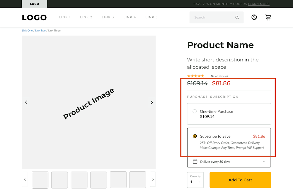
Pricing, variants and options

Pricing needs to be clearly stated and in focus for the users. Some will feel "tricked" if you hide it, make it smaller or if they have to scroll long pages to get to it. Be transparent, people appreciate it.
Variants and options can be about product colours, sizes or other variations. Make sure they're all visible and users can switch between them.
In our template we have a pricing model variation for subscriptions which is something you should consider if your business allows it. Be sure to make that as visible as possible.
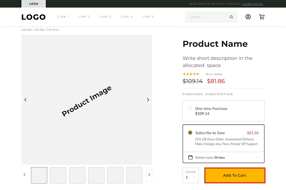
Clear CTA

This is probably the focus and the most important element of what's above the fold, and your whole product page. It's the main goal as it convers users into customers. There's now two ways around this: it needs to be clear and visible. Here are a few other suggestions:
Make it bigger in size to stand out
Use an unique colour scheme for "Add to cart" or "Checkout" across the whole website. Users will mentally associate the colour scheme with the CTA and the final action and it needs to not confuse them with other buttons
Use "sticky CTA" when possible so users have access to this button while scrolling below the fold
Conclusions
Please observe there is a certain hierarchy when arranging elements above the fold. Make sure there is enough spacing between elements, they’re all aligned correctly and fonts and colours are clear and readable.
We could spend much longer discussing and writing about elements on the product page and what needs to sit above the fold. This is article only lays out what's important and why in order for you, as a merchant, to plan valuable actions.
If you're unsure of how to apply all this, or if you just need an expert to be in charge of it, do not hesitate to reach out to us. We will run audits on the page, we will understand business logic, we will scan your users interactions and we will manage and implement all findings.


